A Clearer First-Time Experience for Mojar
Redesigning Mojar's onboarding to improve clarity, momentum, and activation.

The app
So, I came across this app called Mojar.
It is an app which helps users create AI agents to help their customers.
Cool app.
I logged in to this app as a new user.
I got this screen first:
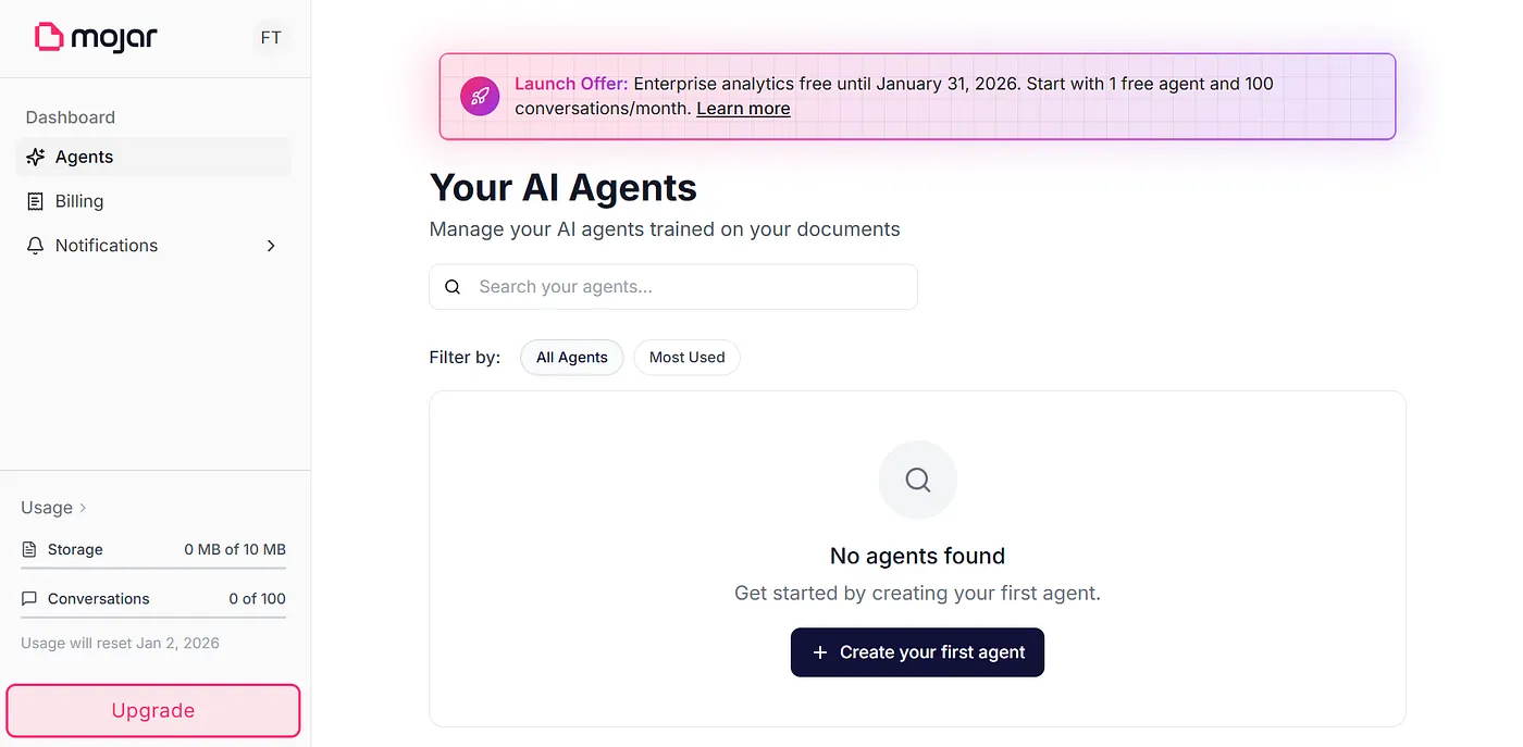 First screen
When I clicked the “Create your first agent” button, they showed this:
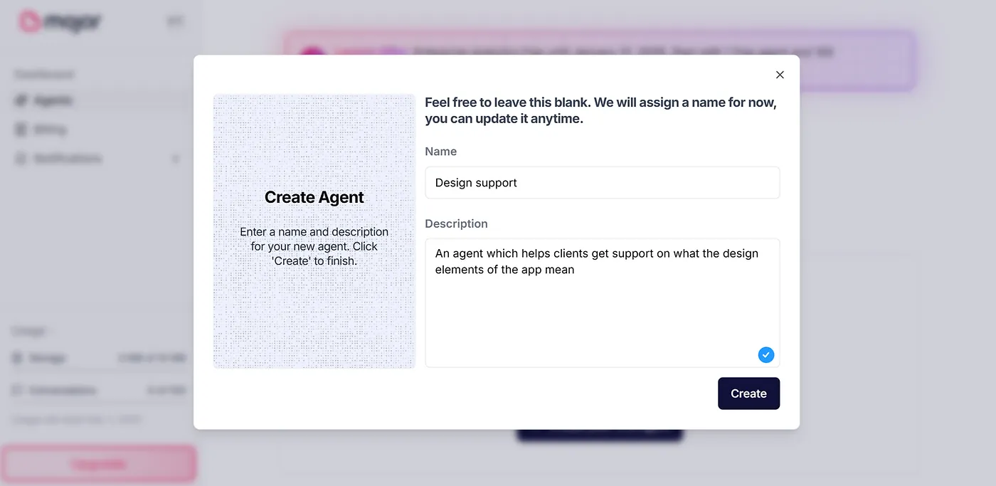 Agent Creation
then this:
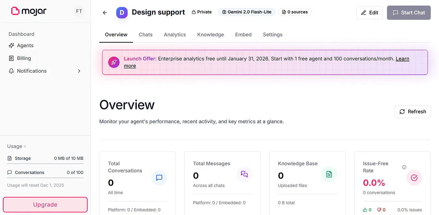 Overview screen
Looks clean. But, it has some hidden problems which make the screen unclear for the users.
The Problem
Just look at this screen:
Overview
What is the user supposed to do here?
What is the action that they need to do?
Which part of the screen makes them do the action?
There is no answer.
This will make users confused, before they even start to use the app.
Even if the user wants to start a new chat to check how their agent works, they have no option.
 Start Chat button is disabled
The Start Chat button is disabled unless the user makes the agent public.
But, where will the user make the agent public??
That option is buried inside the settings as some random toggle.
 Buried inside the settings
Wait….?
How is the agent supposed to work without the knowledge base?
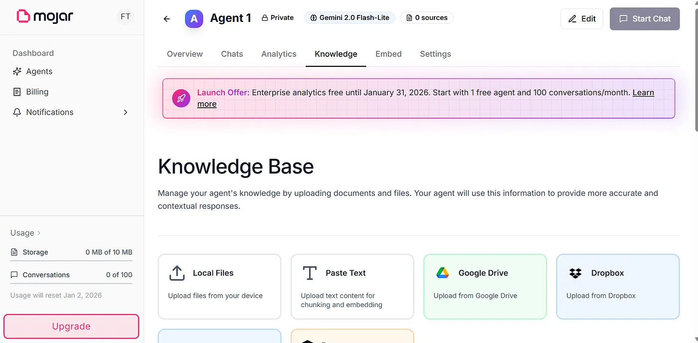 Knowledge base screen
Turns out there is a tab for that.
But wait…
Why didn’t you ask it earlier??
Deducing the solution
So, we saw that they were lagging at the following:
- They immediately made users jump into a dashboard without any context
- They didn’t allow the user to experience the chat
- The core functions are buried or hidden somewhere deep
- They don’t make the user do the important tasks at the beginning itself
- The flow does not guide the user to do anything, it just leaves them at a blank dashboard and asks them to figure it out
So, the solution must be like this:
- Starts with what the user needs
- Makes them do the necessary actions at the beginning itself
- Make them experience the value of the app
- Give them a win
- Guide them along the way, not making them figure out what they need
I decided to do a conceptual redesign for them.
The User Flow
Based on the deduced solution, I analyzed the app.
I then found the 4 actions which will make the user to experience the value of the app instantly and make it clear for them.
From that, I deduced the onboarding flow of the app.
Mermaid Flowchart (Visual)Generating diagram...
Let us see about each one of the screens briefly.
1. Goal screen:
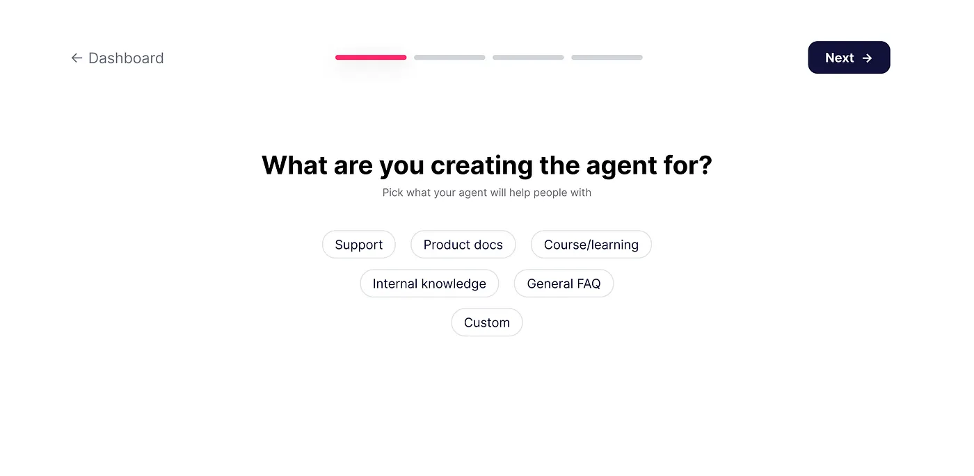 Goal screen design
The goal screen gives users instant direction so they don’t feel lost the moment they enter the flow.
This screen gives them a clear path they can follow with confidence.
And it builds early momentum by removing hesitation and making the next steps feel obvious instead of overwhelming.
It is useful for the product too.
It helps the app personalize the agent based on the users’ goals.
For example, the system prompt for a support agent will be different from a system prompt for an Internal knowledge agent.
2. Knowledge base upload screen:
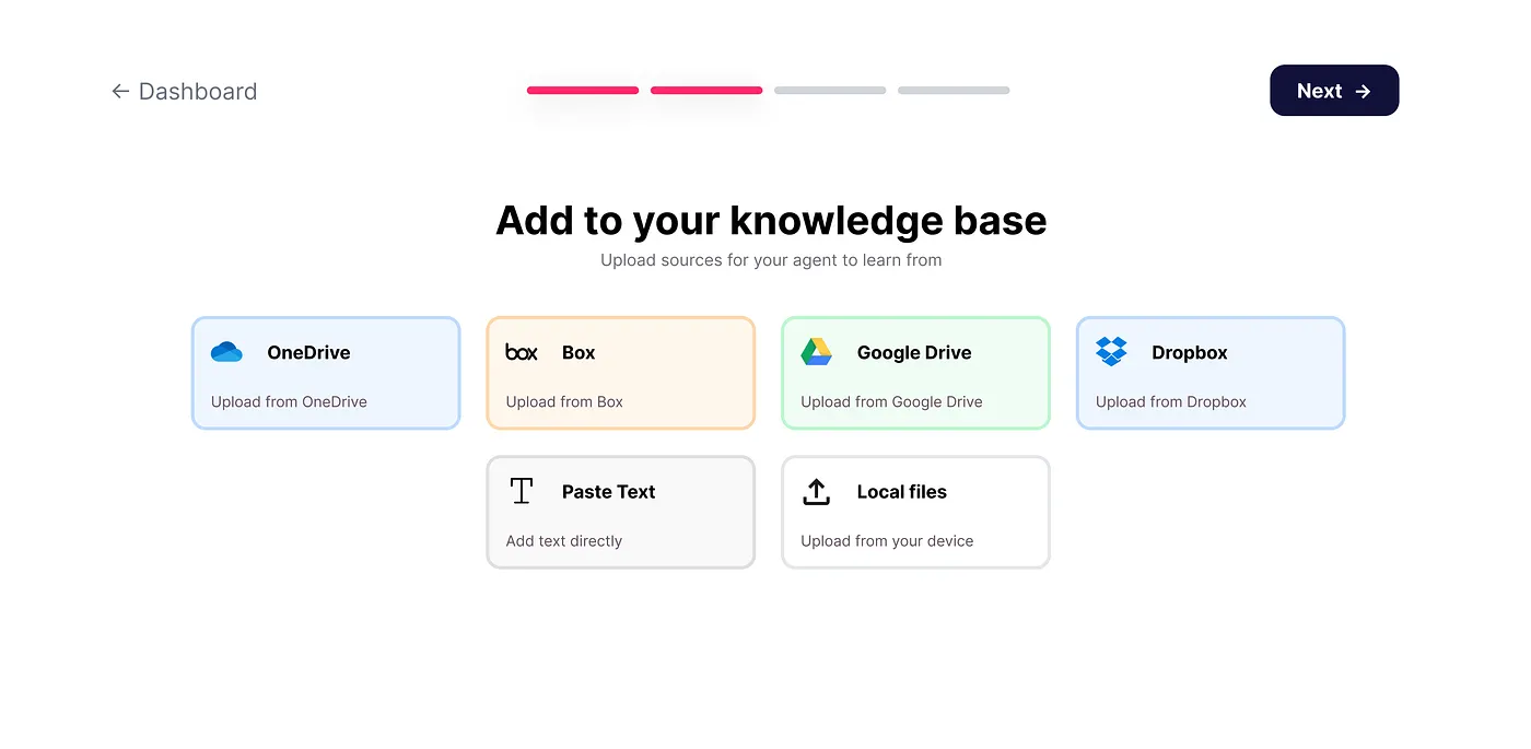 Knowledge base screen design
This is the screen where the user uploads their sources for the agent to learn from.
It gives users a clear, simple way to add their content without stressing about formats or technical steps.
Also, it builds confidence to the users because users feel like they’re giving the agent the exact knowledge it needs to answer questions correctly.
In the app, Mojar has hid this option somewhere as a separate tab.
But the knowledge base should be updated at the onboarding itself.
3. Skeleton screen:
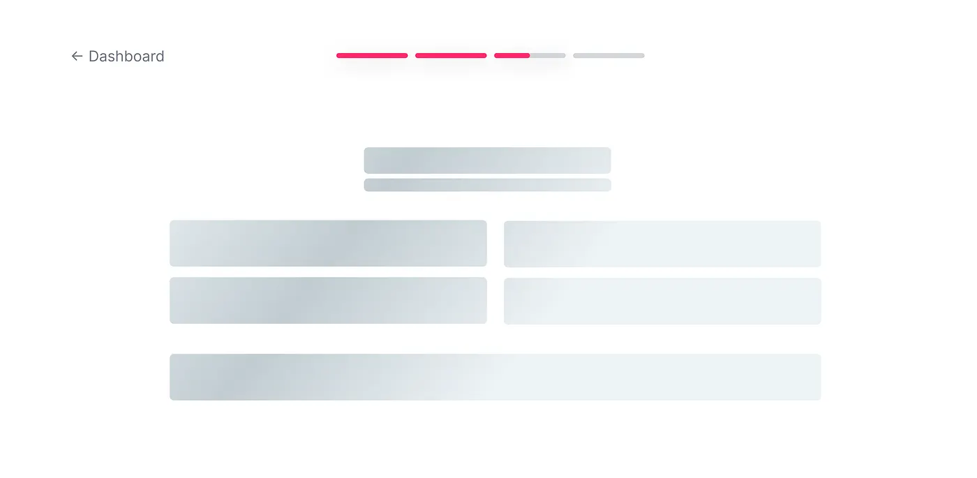 Skeleton screen design screen
There are reasons why I put this as a separate section here.
For context, this is the screen which shows up immediately after the user has uploaded all their sources.
It shows before the user gets to preview their agent.
It shows for 2–3 seconds and move on to the next screen.
Alternatively, I could’ve just put the agent preview screen. But no.
Imagine you order at an expensive restaurant, and they bring your food within a couple of minutes. Creepy, right? Same here.
We are voluntarily giving that delay to give users mental peace that something is being cooked under the hood.
4. Agent preview screen:
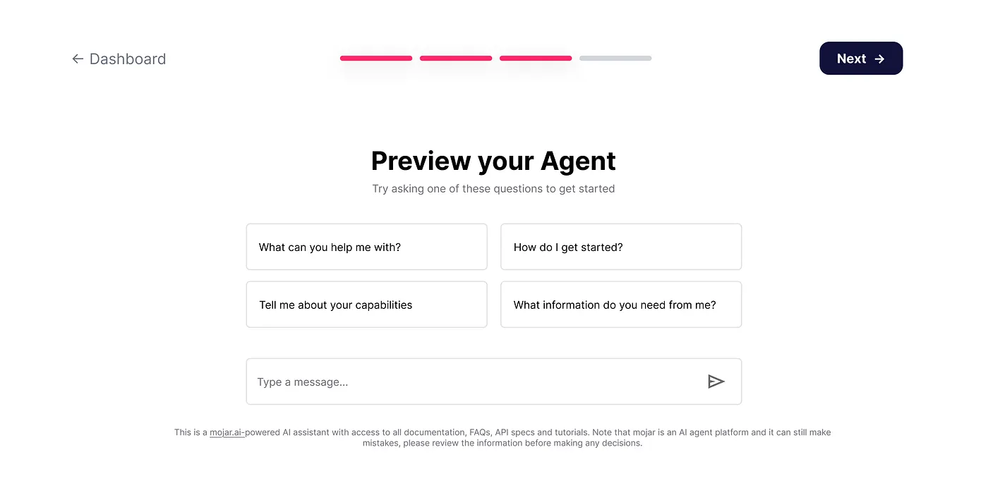 Agent preview screen design
This is the screen where users realize the value of the app.
Based on the input of the users (goal and knowledge base), this agent is customized.
Users will get to use the app, feel the aha moment which may make them eventually convert as paid users later.
5. Share screen:
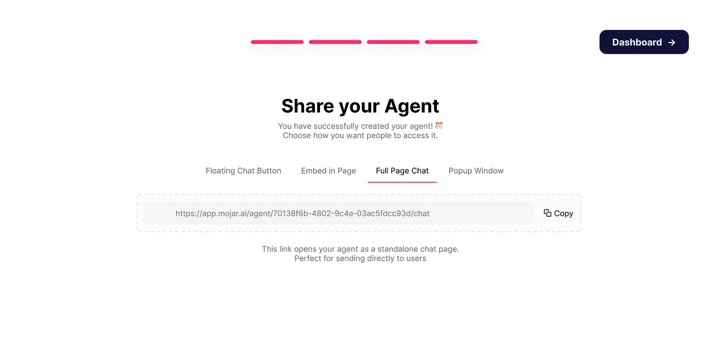 Share screen design
This is the final screen in the onboarding flow.
Now that the user have created everything, they need to make this AI agent drive results for them.
So, what is the thing they should be doing?
Sharing the agent with others…
This is what the screen should be nudging the users to do.
Also, I have included the 4 types of sharing options: full page chat, embed, popup, etc.
Users can choose whatever they want.
Key decisions in the app
There were some small decisions in the app which I made. Let us go through each of them:
1. Progress bar:
 Progress bar in the designs
As simple as it sounds, progress bar plays a main role in the user flow.
Earlier, in the problem statement, I said that the app’s user flow doesn’t guide users.
Progress bars solve this problem.
Firstly, it tells the user that there is an n no. of steps that they should take.
Secondly, it gives users a peace of mind that the flow contains just 4 steps, and it is not a 15-page form that they have to fill up.
2. Top navigation:
 Top navigation
The onboarding had completely different layouts.
One screen had a big empty space at the bottom.
Meanwhile, for another screen, the bottom part (chat) was the main part.
So, to maintain consistency, I decided for a consistent top navigation.
3. Using existing elements:
 The design uses existing elements from the app
I tried to reuse the existing elements instead of creating new ones.
I did this because more designers try to invent new elements & feature when they redesign a product.
This slows up development cycles, etc.
So, I decided to reuse the existing elements itself.
4. Simple microcopy:
 microcopy inside the app
Words should never be a barrier for the user to understand the app and its flow.
So, I made sure that the microcopy throughout the app was made simple.
I avoided jargons as much as possible throughout the app.
What I learned:
This breakdown gave a good opportunity for me to learn so many things.
1. Shorter is not always better
When comparing both the flows, one seems longer, and another one seems shorter.
But in reality, the shorter one confuses the users more than the longer one.
2. Split the problems to be solved
The dashboard, which was originally shown in the app, tried to solve every single problem at once.
This made it unclear even when the screen was clean to look.
Instead, when the problems were split into sub problems and spread throughout the flow, it makes sense for the user to solve the problems.
3. Prioritize what needs to be shown:
Every single problem is not that important.
At least at the beginning.
The original dashboard didn’t prioritize anything.
It just showed everything at once.
But when the correct problems were prioritized, it makes sense for the users to solve them all one by one.
4. Momentum matters more than anything:
Originally, the app doesn’t give users any momentum.
It just throws them onto a dashboard.
And after that? Figure it out…!
But, after I add the flow, it gives the screens a momentum on what to do next.
Momentum > features
What I’d improve next:
If I continued this as a personal exploration, these are the areas I’d improve next:
1. Customizing the Agent Before Sharing:
Right now, users create the agent → preview → share.
But some users might want a bit more customization options.
So, I would try to add some customization options like tone, branding, response style etc.
2. For those who have more needs:
Not all users might want to share the agent immediately.
Some might want to keep it as a draft and edit it later.
I would include an “Add to drafts” button at the share screen.
3. Completing the Hook model:
Nir Eyal (Author of Hooked) has a famous four-phase process to create habit-forming products.
It is Trigger → Action → Reward → Investment.
Our onboarding is at the mid-part of the investment phase.
We need to make the user invest more like adding teammates, custom domains etc.
We may not show it all at once, but we can do it little by little.
4. Visual previews for shared modes:
The share tabs are good, but they need some visual clarity.
Some users might not know the difference between floating button, popup etc.
So, I’d add a small visual thumbnail if I worked more on the project.
Conclusion
The goal of my redesign wasn’t fancy UI or trying to “fix Mojar.”
It was rather taking a messy, confusing flow and turning it into something people can actually follow without thinking.
Breaking the work into smaller, clearer steps made the whole experience calmer and more predictable.
I learned a lot while rebuilding it, and there’s still more I’d explore if I kept pushing this concept. On to the next one.