Designing the Discovery Systems in cto.new
A redesign of cto.new’s achievement and discovery system focused on making progression feel visible during normal product usage.

Executive Summary
Developer tools often struggle with feature discovery because users stay focused on completing tasks rather than exploring the workflows of the app. This hurts feature discovery in the app.
While using cto.new, I noticed the product already had a progression and achievement system, but the flow was in such a way that users rarely became aware of it during normal usage.
This case study explores how lightweight behavioral feedback on cto.new can improve discovery and progression awareness without interrupting builder workflows or relying on aggressive gamification patterns.
Core Problem
While exploring the app, I noticed that the product had an achievement system and hidden discovery features.
But they were barely noticeable.
 Achievements are just another item in the sidebar
It was easy for users to completely forget the system even existed.
The product was already tracking user actions, calculating achievements, and building the system behind the scenes, but users can rarely see any of it while using the app.
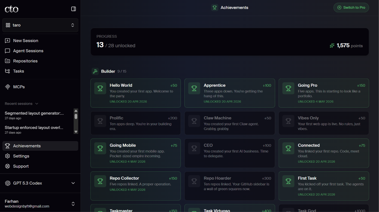 The original achievement system of the app
The achievement system was supposed to encourage deeper exploration and feature discovery, but most users rarely noticed it because it lived passively in the sidebar.
As I explored the system further, I realized the root cause of the issue was multiple small breakdowns across the achievement experience.
For this project, I focused on two problems that most strongly affected user exploration and discovery.
Problem 1
The product already showed achievement toasts after certain actions.
For example, connecting a repository triggered something like:
{Achievement Name} - +X pts
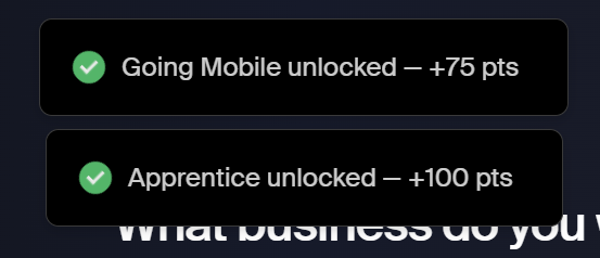 Currrent notification system for the achievements
The toast disappeared within seconds, and the experience immediately ended there.
Once the toast disappeared, there was nothing connecting the moment back to the larger achievement system.
As a result, achievements felt like some random notification instead of part of a larger exploration experience.
Once the toast disappeared, users lost all visible connection to the achievement system.
Most users were unlikely to stop their workflow, manually open the achievements page, and investigate what else existed inside the system.
Especially in builder tools, users tend to stay focused on momentum and task completion.
So even though achievements technically existed, they rarely stayed visible long enough to influence future behavior or exploration.
Problem 2
The product contained hidden achievements and deeper workflows designed to reward exploration.
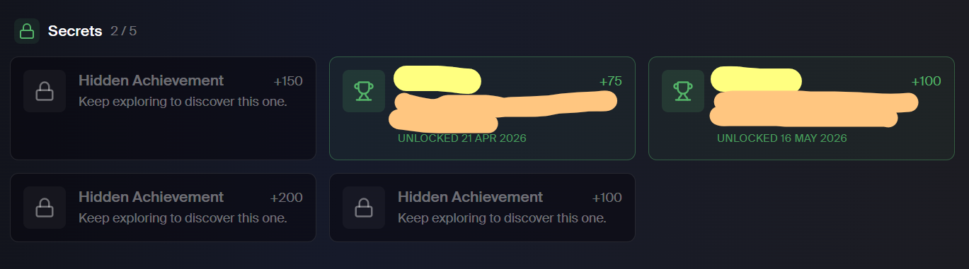 Secret achievements in the app
But the system gave users almost no indication of that secret achievement.
The hidden achievements remained completely invisible unless users accidentally triggered them.
As a result, discovery inside the product felt random rather than intentional.
The experience relied heavily on users stumbling into hidden systems on their own.
The hidden achievement system had strong potential to encourage feature discovery and deeper exploration.
But the product made them so difficult to notice that most users never discovered them.
Design Philosophy & Pushbacks
1. Preserving Workflow Continuity
Early on, I explored ways to make achievement moments feel more visible and rewarding.
I experimented with ideas like fullscreen achievement moments, inline expansion blocks, and larger feedback states after actions like connecting a repository.
But they all created the same problem: they interrupted the workflow.
Fullscreen moments broke momentum, while inline blocks caused layout shifts and pushed surrounding content around.
Instead of supporting the workflow, the system kept asking users to stop and pay attention to itself.
Rather than designing bigger celebration moments, I started focusing on continuity.
My goal became: acknowledging the user's progress without disturbing them for what they came for.
2. Designing Curiosity Without Manipulation
The second problem was harder to name.
I wanted to create curiosity, but every early idea started feeling like a gamified engagement trap.
I explored ideas like hidden progress indicators like "4/5", nearby discovery hints, teasing copy, stronger attention states. I tried most of them.
They all felt manipulative.
Technical users are usually very sensitive to engagement-driven patterns.
This made me focus on subtle acknowledgment and letting users discover things naturally instead of pushing exploration too aggressively.
3. Building Consistent System Language
As the system grew, I kept running into multiple options.
For context, Problem 1 had already established that a highlighted sidebar state meant an unlocked achievement.
But when I tried reusing that same visual treatment to hint at a nearby hidden discovery, it created confusion.
The same signal was now doing two different jobs.
The same issue showed up in smaller places like inconsistent XP visibility, overlapping attention states, etc.
I fixed by using a consistent system language throughout the app.
It became easier to read the system once everything was consistent.
Solution
Problem 1: Making Progress Visible
The achievement system rewarded certain actions.
But the product didn't explicitly rewarded doing those actions.
The achievement system existed, but it was separated from the actual experience of using the product.
Most users never noticed it or realized there were more things to discover.
The Solution
1. Lightweight Achievement Toasts
After meaningful actions, the system can surface a lightweight achievement toast in the top-right corner.
Example:
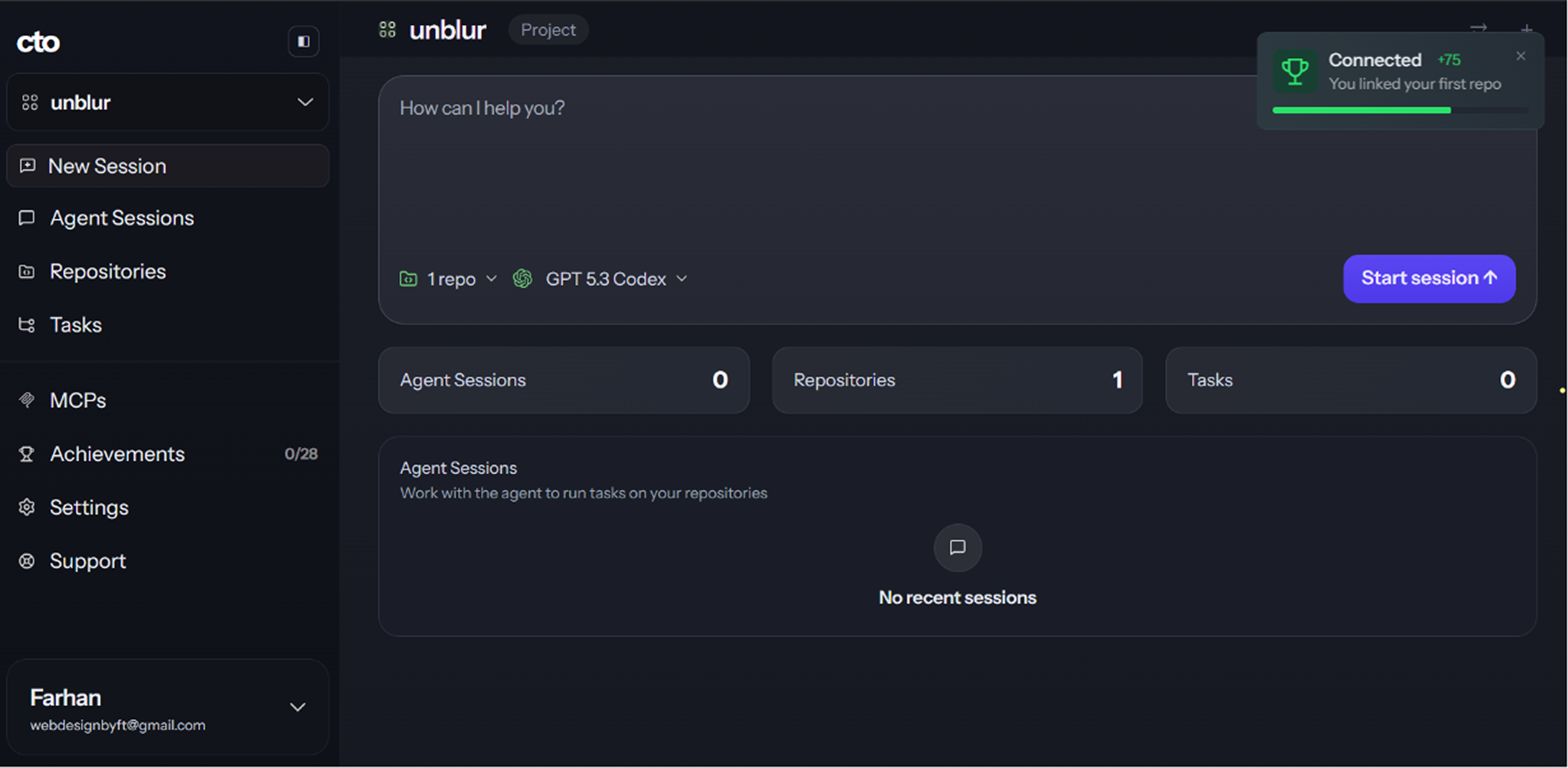 Suggested toast notification
Instead of interrupting the user, the toast behaves like lightweight peripheral feedback.
I intentionally avoided fullscreen celebrations because they interrupted workflow continuity and made the product feel gamified rather than tool-oriented.
2. Clickable Toast Instead of CTA Buttons
Earlier explorations included CTA buttons in the toast like:
- “View all achievements”
- “Run your first agent”
To avoid complexity, the entire toast becomes clickable.
The toast simply creates awareness and allows users to explore further if they choose to.
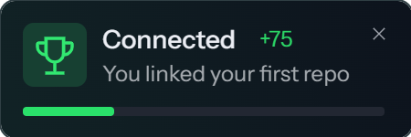 standalone image of the toast notification
3. Persistent Sidebar State
After the toast disappears, the sidebar enters an “attention seeking” state:
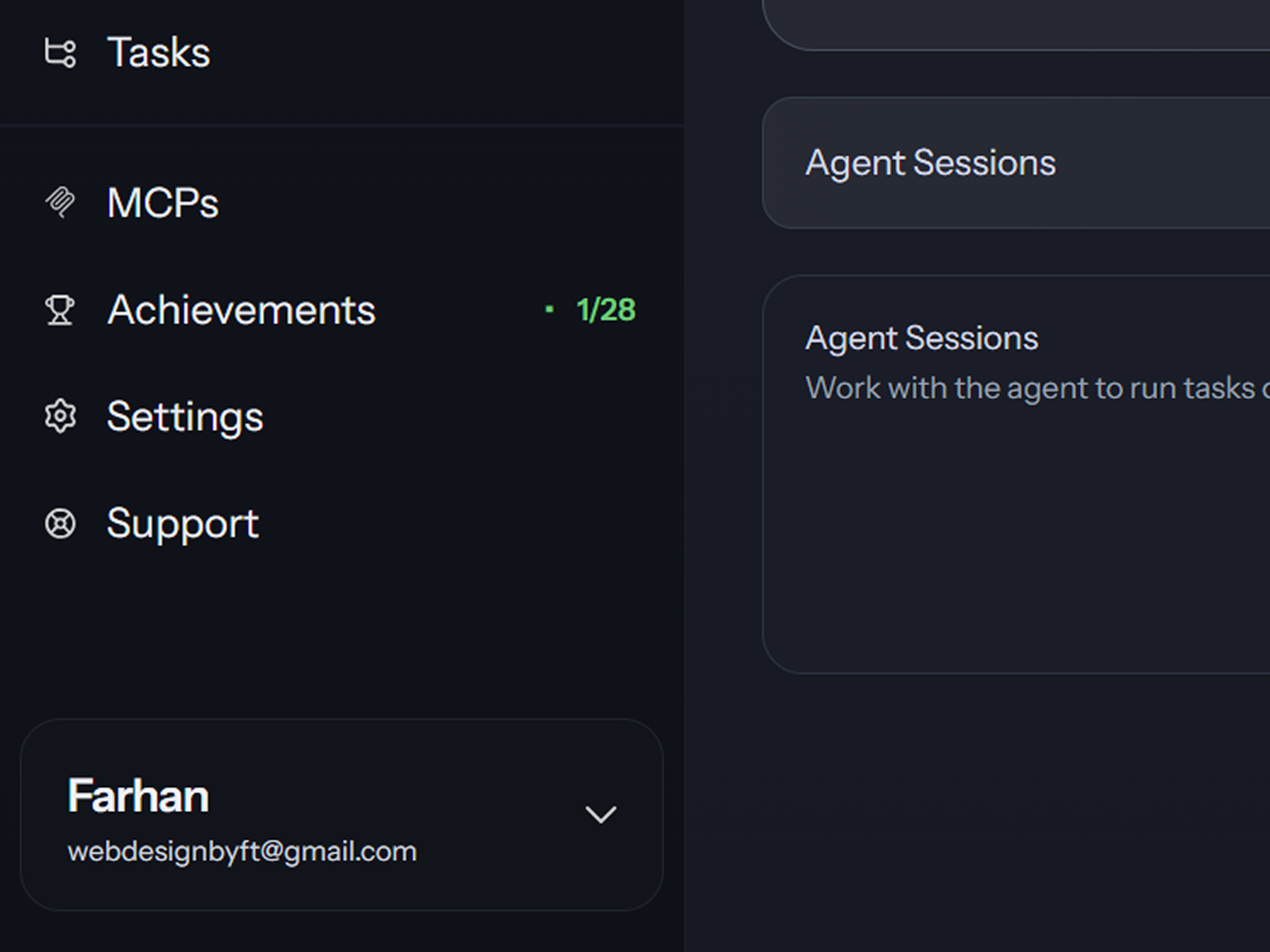 The achievmements section in the sidebar tries to seek the attention of the user
Instead of forcing immediate interaction, the system quietly creates curiosity after the initial feedback moment (toast) disappears.
I wanted the discovery system to command a little attention but also not disturb the other workflows.
The sidebar state keeps the achievement visible without interrupting ongoing workflow.
4. Acknowledgment-Based Reset
The sidebar state only resets after the user actually visits the achievements page.
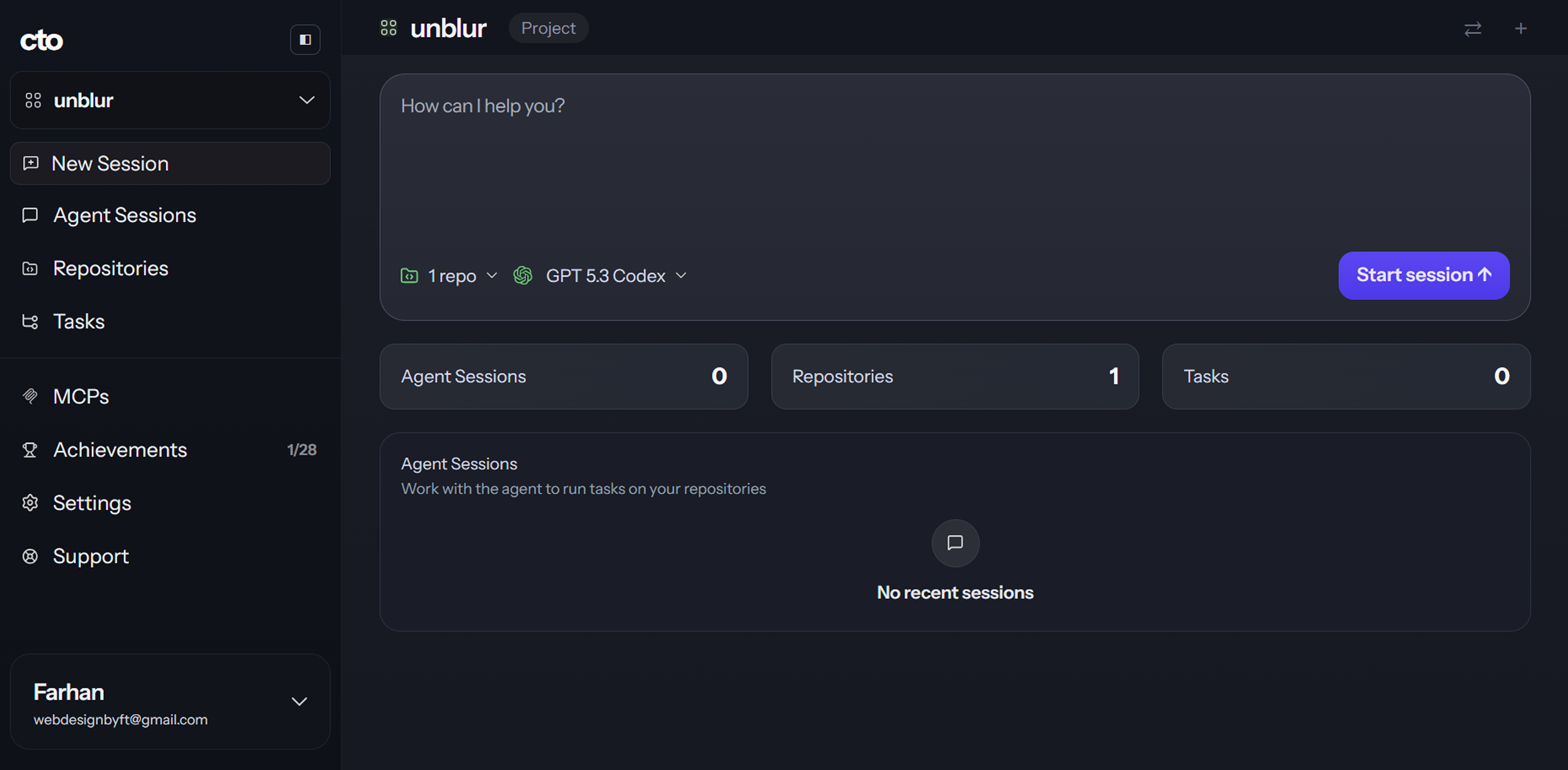 After the user has done the desired action (clicking the achievement), it returns to a state such that it doesn't seek attention
This created a more intentional acknowledgment loop where the system waits until the user has genuinely seen the unlocked achievement before returning to its default state.
This way, we make them get a grasp of the achievement system completely.
5. Final Behavioral Flow
The final flow:
Mermaid Flowchart (Visual)
This way, the app can change achievements from a hidden system users rarely noticed into feedback that appears naturally during normal product usage.
Problem 2: Teasing Hidden Secrets
The Existing Experience
The product already contained hidden achievements, but users had no meaningful way to understand that certain repeated behaviors or workflows are important.
Secrets were hidden so aggressively in the app.
Meanwhile, this was supposed to be a great opportunity for feature adoption.
The Solution
1. Repeated Behavior Recognition
Instead of keeping repeated behavior completely silent, the system can respond by teasing the achievement after users repeatedly hit a workflow pattern.
Example:
There is a secret achievement called Speed Limit which user gets after hitting daily limit for n times.
At the (n-1)th time:
We can show a little toast notification teasing the achievement.
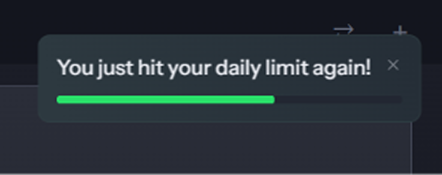 Initial toast notification teasing the achievement
The message is intentionally made to be subtle.
I intentionally avoided mysterious or gamified language because technical users detect engagement bait very quickly.
2. Removing Explicit Hidden Progress
Some of my early explorations included:
- hidden progress indicators like “4/5”
- partially revealed achievement names
- mystery teaser states
I removed these because they collapsed mystery into checklist behavior.
Instead of creating curiosity, they made the system feel collectible and game-like. Once users can clearly see progression states, hidden achievements stop feeling hidden.
I wanted the system to preserve mystery without becoming obscure.
3. Secret Achievements Behave Like Normal Achievements
Once users repeat a workflow enough times to activate a secret achievement, the unlock experience behaves exactly like every other achievement in the system.
The product surfaces a lightweight achievement toast:
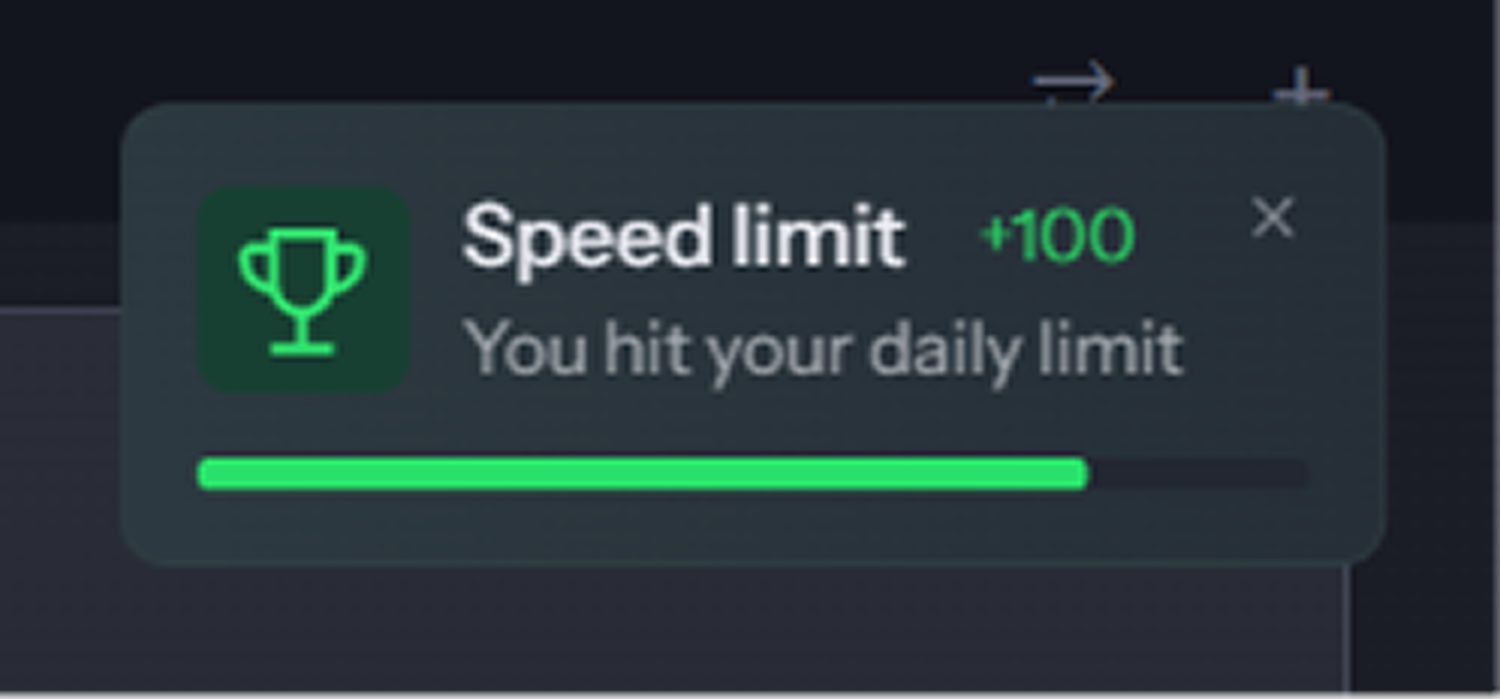 Toast notification about the achievement
Then the sidebar enters the same unacknowledged achievement state used in Problem 1:
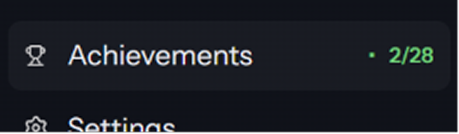 Attention-seeking state of the achievements section
This creates consistency across the entire progression system.
Mermaid Flowchart (Visual)
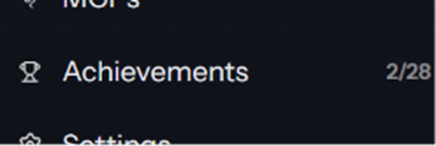 The achievements sidebar returns to its original state after the user has visited the achievements page
I intentionally reused the same achievement infrastructure because consistency helps users build mental models around the achievement system.
Expected Impact
More Feature Discovery During Normal Usage
In the original system, achievements and hidden capabilities lived completely outside the workflow.
Most users never find them.
This hurt feature discovery.
The redesign brings lightweight feedback directly into key moments, so discovery happens during normal usage instead of depending on users to go looking for it.
More Meaningful Exploration
The original experience treated discovery as something accidental.
The redesigned system creates small moments of curiosity tied to real user behavior, which makes exploration feel more intentional and connected to what users are already doing inside the product.
Instead of aggressively pushing users toward hidden features, the system uses subtle signals that encourage exploration without interrupting momentum.
Better Workflow Continuity
Many common engagement patterns were intentionally avoided throughout the redesign process, including fullscreen celebrations, intrusive reward mechanics, and aggressive nudges.
The final system reinforces progression while still preserving the fast, focused workflow expected inside a developer tool.
Closing Reflection
One of the biggest things I learned during this project was different tools require different decisions.
The real problem in the app was not the achievement system itself. The product already had one. Users just rarely noticed it while using the app.
The solution was simple. But reaching that simplicity required careful decisions around tone, timing, visibility, and restraint.
By the end, the project felt less like redesigning achievements and more like designing lightweight feedback systems for exploration and progression.