Rethinking Bus Discovery in Chalo
A product design case study on reducing navigation by rethinking Chalo's information architecture

One evening, I was leaving Anna Centenary Library in Chennai and heading home.
Like many commuters, I opened the bus tracking app Chalo to answer a simple question:
Which bus should I board?
The answer should have taken a few seconds.
Instead, it required opening eight different route pages.
And I found out that the problem relied on the structure of the app.
This case study explores how a small information architecture change can significantly reduce navigation and cognitive effort without redesigning the visual interface.
The Context
From Anna Library to my home, I usually have two possible routes.
- 5C
- 21G
Both routes are available in multiple variants.
- Normal
- Deluxe
- AC
- Express
As a commuter, I wasn't interested in bus variants.
I simply wanted to know:
Should I wait for the next normal bus, or board the Deluxe or AC bus arriving sooner?
That decision required comparing multiple arrivals across different variants.
Instead, Chalo required me to visit every route individually.
The Problem
To answer one question, I ended up navigating through eight different route pages.
For a single commute, my flow looked something like this:
- 5C Normal
- 5C Deluxe
- 5C AC
- 5C (reverse direction)
- 5C Deluxe (reverse direction)
- 21G Normal
- 21G Deluxe
- 21G AC
Every page represented another step toward making the same decision.
The more I used the app, the more repetitive this workflow became.
There was a structural problem in how the information was organized.
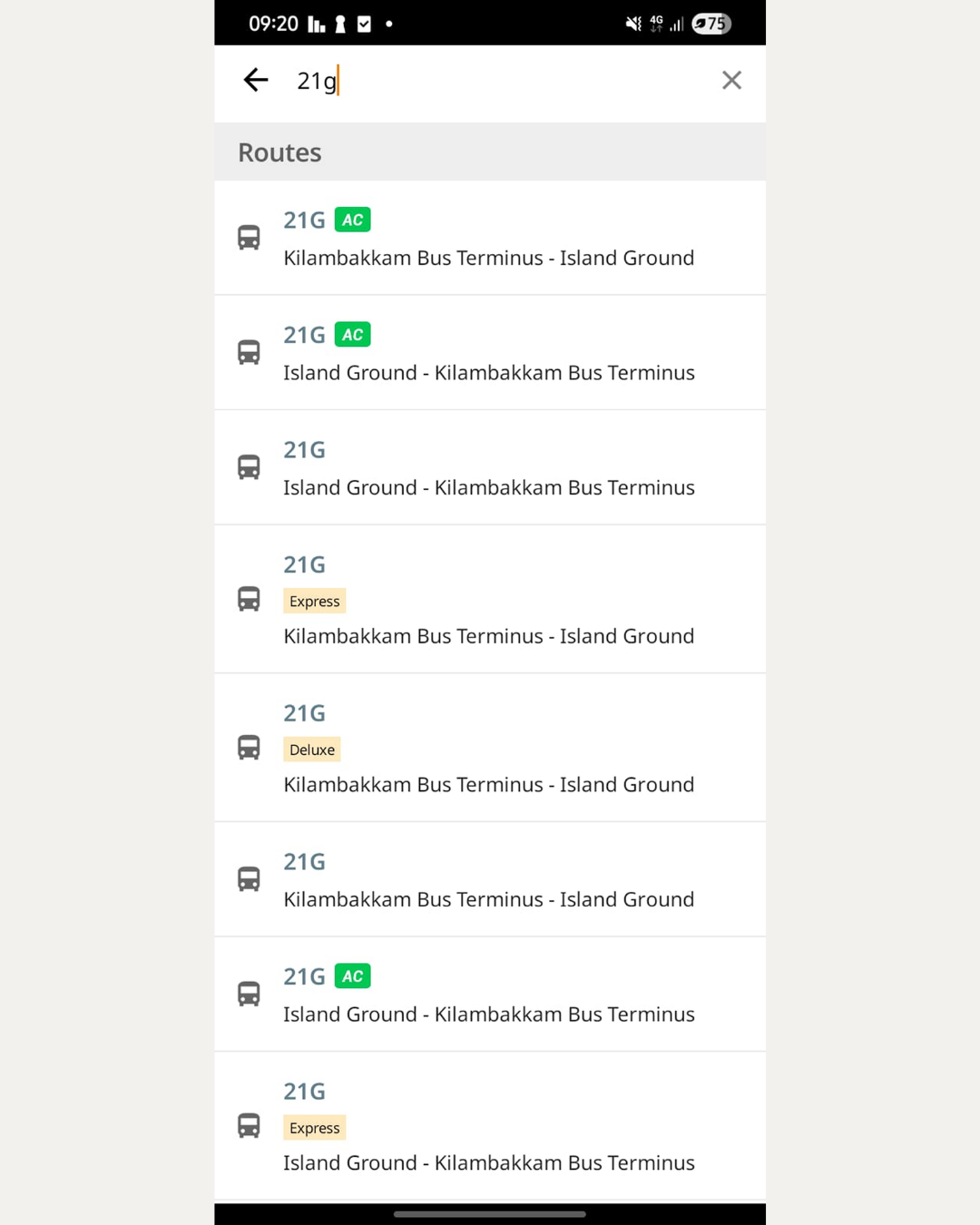 Current search results
Understanding the Root Cause
Initially, this looked like a navigation issue.
After stepping back, I realized the problem was deeper.
Chalo organizes information around bus variants.
But, Users organize their thinking around travel decisions.
Those are two very different mental models.
The system forces users to manually assemble information that could already exist in one place.
That mismatch creates unnecessary navigation and cognitive load.
Defining the Scope
It would have been easy to redesign the entire experience.
I intentionally didn't.
The visual language already works.
The friction comes from the information architecture, not the interface.
Instead of changing colors, layouts or branding, I focused on helping the users in discovering and comparing route variants while deciding which bus to board.
This redesign does not attempt to change:
- Live tracking
- Maps
- Search
- Branding
- Visual identity
Keeping the scope intentionally small allowed every design decision to remain focused on solving one real problem.
Design Principles
Before opening Figma, I established three principles.
1. Organize around commuter intent
People don't open Chalo to browse bus variants.
They open it to decide how to travel.
Routes should support that decision rather than fragment it.
2. Preserve familiar mental models
Although I reduced the number of route pages dramatically, I intentionally kept two separate direction pages.
- Origin → Destination
- Destination → Origin
The current product already teaches users this navigation pattern.
Replacing it with a single interchangeable screen would introduce a new mental model without solving a meaningful problem.
Instead, direction switching remains available through the overflow menu as a secondary action.
This keeps the primary experience focused while preserving existing behavior.
3. Change structure, not visuals
Every design decision in this project was structural.
The objective wasn't to make Chalo look different.
It was to make it require less thinking.
The Solution
Step 1: Simplify route discovery
Instead of displaying every route variant as an independent result, each route now appears only twice.
One page represents:
Origin → Destination
The other represents:
Destination → Origin
This immediately reduces the number of entry points users need to consider.
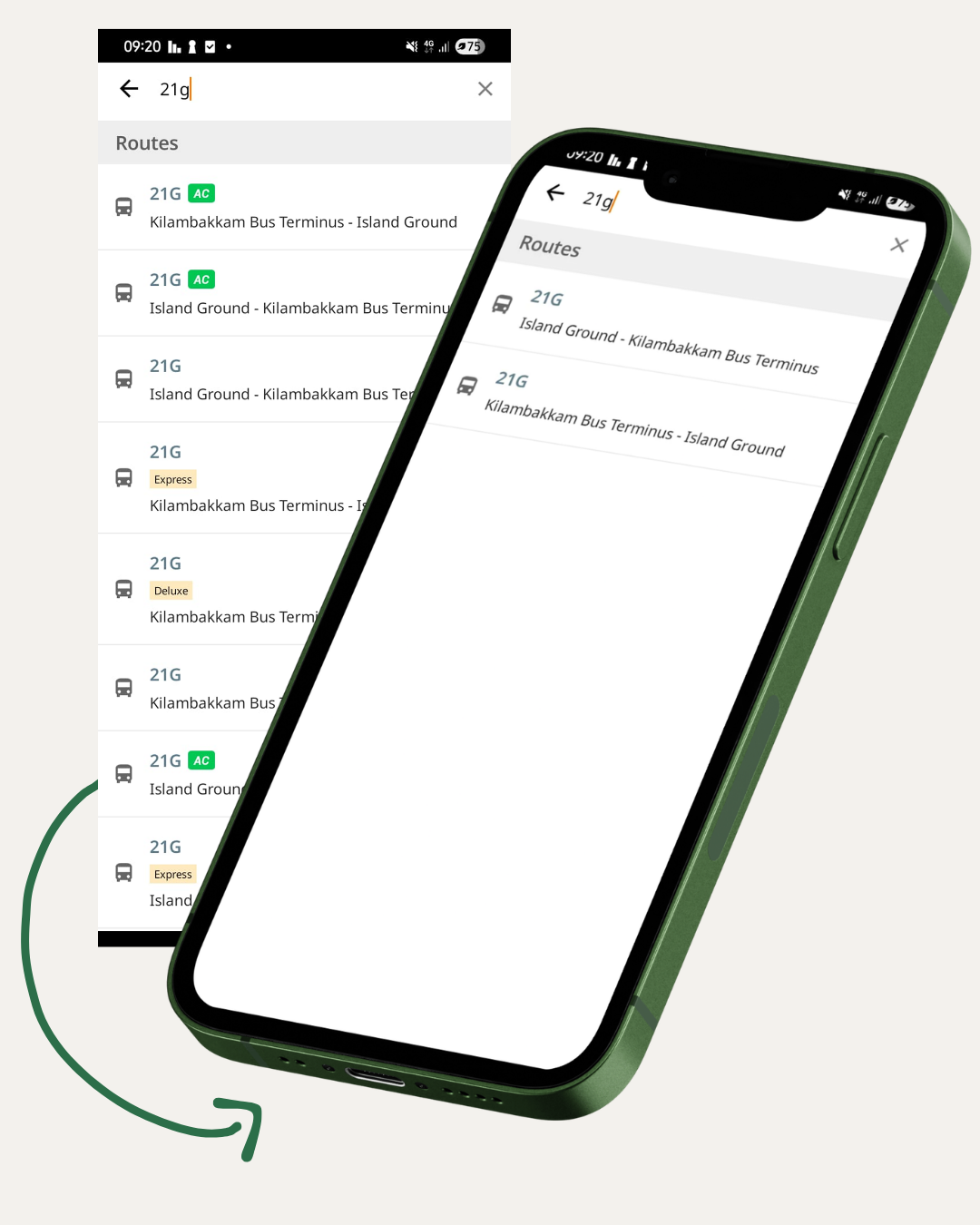 Before vs After
Also, I recommend that we show a switch option inside the three dot icon as the switching bus stop is just a secondary action of the app.
Initially, it need not be nudged, but we can nudge if the user is always comparing between stops X and Y and Y to X.
Step 2: Move variants inside the route
Once users open a route, variants become attributes instead of destinations.
Rather than navigating into separate pages for AC, Deluxe or Express buses, users now see all arriving buses together.
Small tags distinguish each variant.
- AC
- Deluxe
- Express
Normal buses intentionally remain untagged because they represent the default expectation.
Users no longer have to remember which page they came from.
Everything needed for comparison exists within one view.
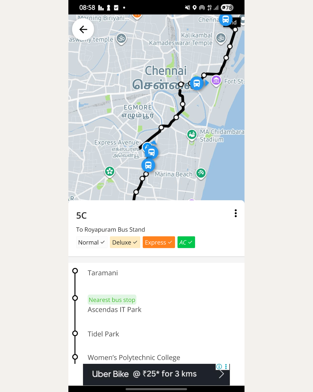 All buses are available in one page
Step 3: Filter instead of navigating
Not everyone wants every bus type.
Some commuters only board AC buses.
Others only use normal buses.
Instead of forcing additional navigation, filters allow users to instantly control which variants are visible.
This transforms variants from separate destinations into optional views of the same information.
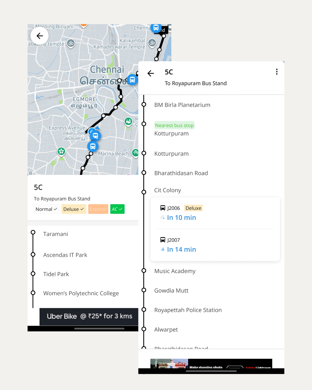 Tags which act as filters
Trade-offs
Every design decision involves compromise.
One idea I explored was adding a dedicated switch-direction button directly within the interface.
Although this reduced one tap, it also gave a secondary action equal visual importance as the primary task.
Since the purpose of this screen is checking bus arrivals, I chose to prioritize clarity.
Switching directions remains available through the overflow menu while the interface stays focused on helping users make travel decisions.
Reflection
This project reinforced something I find myself thinking about repeatedly as a product designer.
Many usability problems don't originate from the interface itself.
Sometimes, the interface isn’t a problem.
The problems originate from how information is organized.
Improving usability sometimes simply requires aligning the product with how users naturally think.
In this case, the interface stayed almost exactly the same.
The structure changed.
That change alone reduced unnecessary navigation while preserving the product's existing visual language and interaction patterns.
Limitations
This redesign is based on repeated personal use of Chalo and heuristic product reasoning.
It has not been validated through usability testing.
If I were continuing this project, I would test:
- Time taken to identify the best bus before and after the redesign.
- Whether users immediately understand the variant tags.
- Discoverability of the filtering interaction.
- Discoverability of direction switching within the overflow menu.
- Overall reduction in navigation effort.
Outcome
After documenting this redesign, I have shared my observations and proposal with the Chalo team.
Whether this exact solution is implemented isn't the point.
The value of this project lies elsewhere.
It demonstrates how a focused information architecture intervention can simplify a real-world commuter workflow without changing the product's visual language.
If there is one thing to takeaway it is that the best UI is not the one with many screens, but it is the one which makes the user do their task without making them go to multiple screens while preserving the clarity of the app.